This is an interactive Tableau dashboard using my own personal workout data. You can find the direct link to the Tableau Public dashboard here. The Excel dataset can be found here. I used it to analyze my own strengths and flaws in my strength growth process. Click the rear upper muscle group to see an example of one of my flaws. I’ve had issues with the volumes coming out incorrectly when I add the muscle group bar, I’m still working on fixing that.
Here is another interactive dashboard from Tableau. I’ve embedded it as an iframe so you can interact directly with the Tableau dashboard from here without having to navigate to Tableau. However if you want to visit the page directly you can view it here. I created this dashboard as part of the Google Advanced Data Analytics course I am currently taking.
Here is another interactive dashboard from Tableau. I’ve embedded it as an iframe so you can interact directly with the Tableau dashboard from here without having to navigate to Tableau. However if you want to visit the page directly you can view it here. I created this while doing a Tableau course on Coursera.
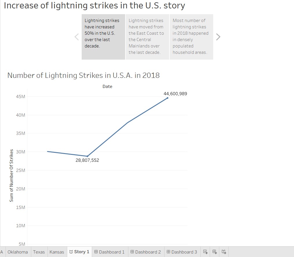
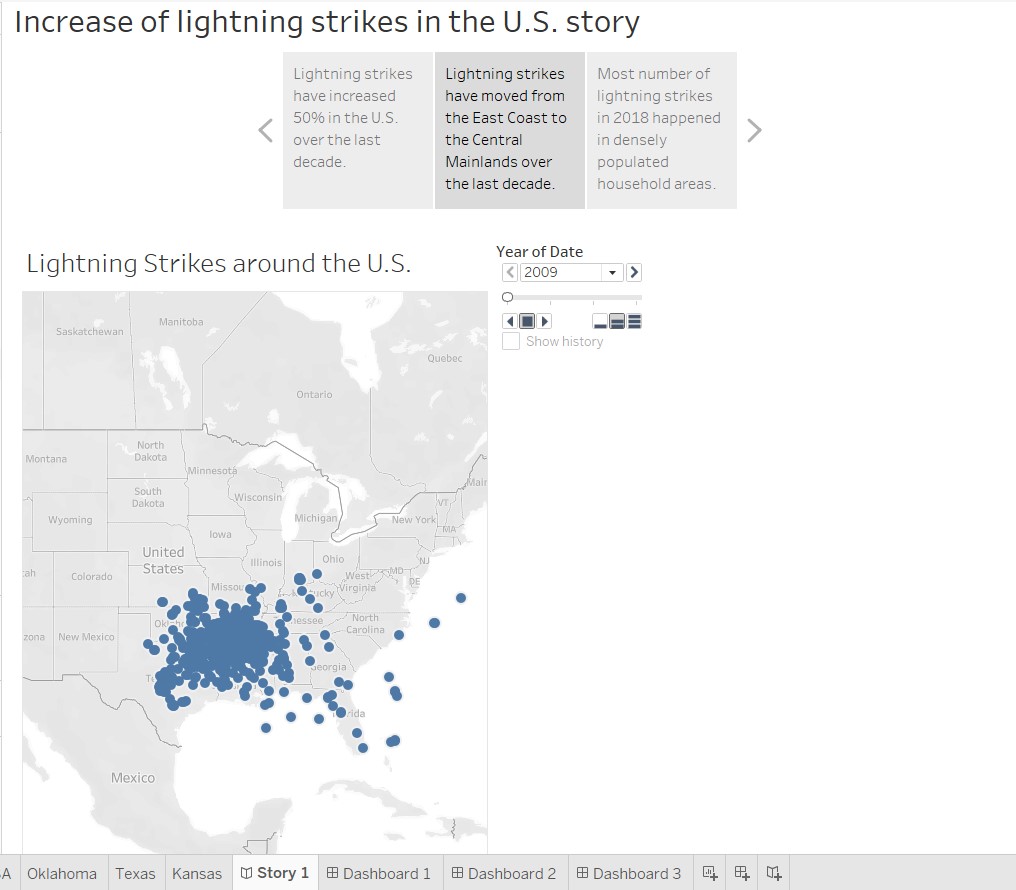
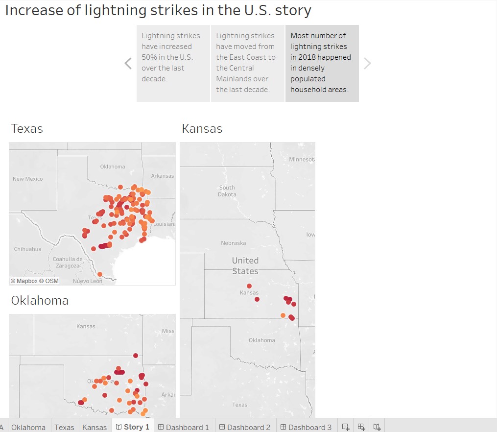
A Tableau story of some geographic mapping analysis of lightning strike increase across the U.S., years 2009 – 2018 and the 3 states mainly effected by the increase in strikes. Analysis done through course work in Google Advanced Data Analytics course.
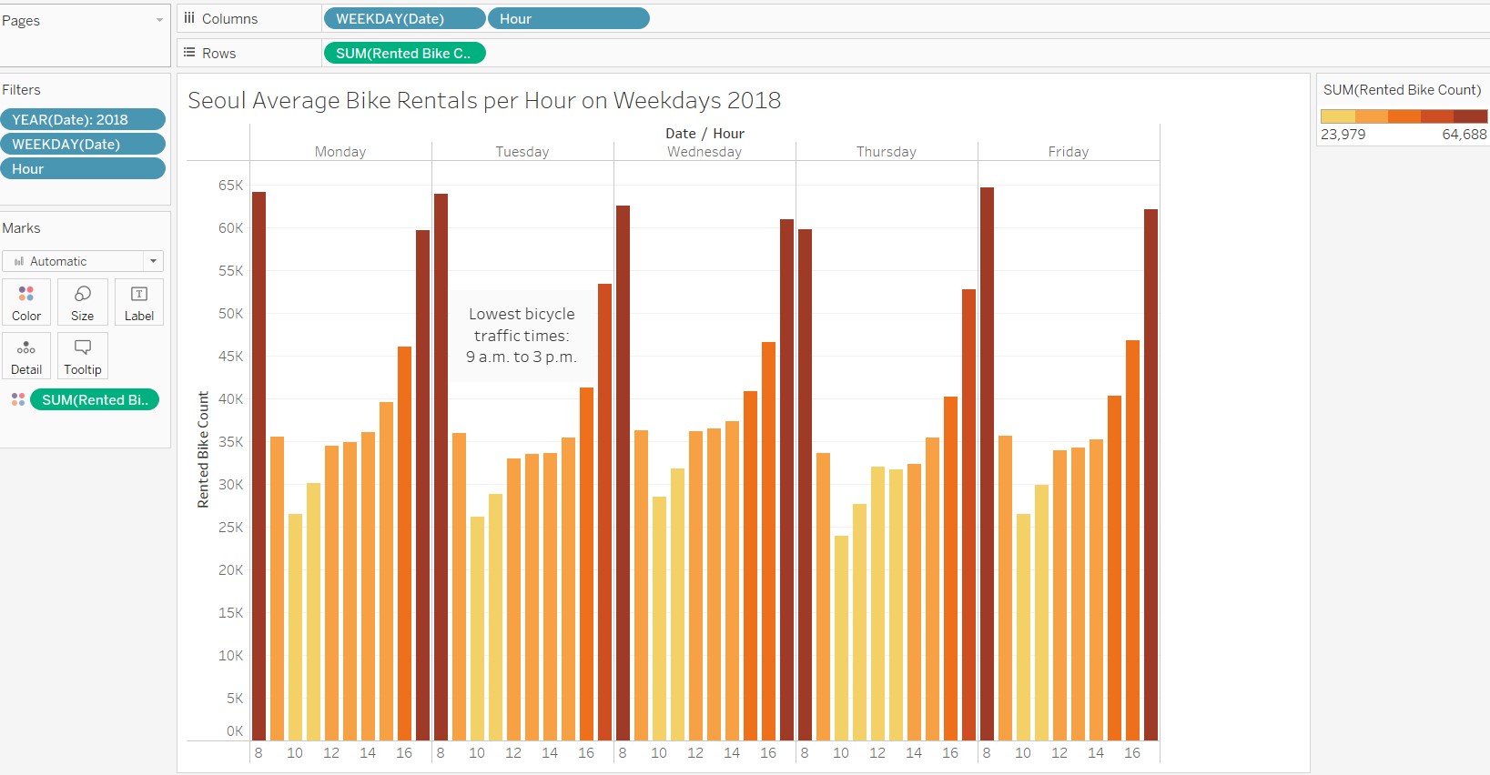
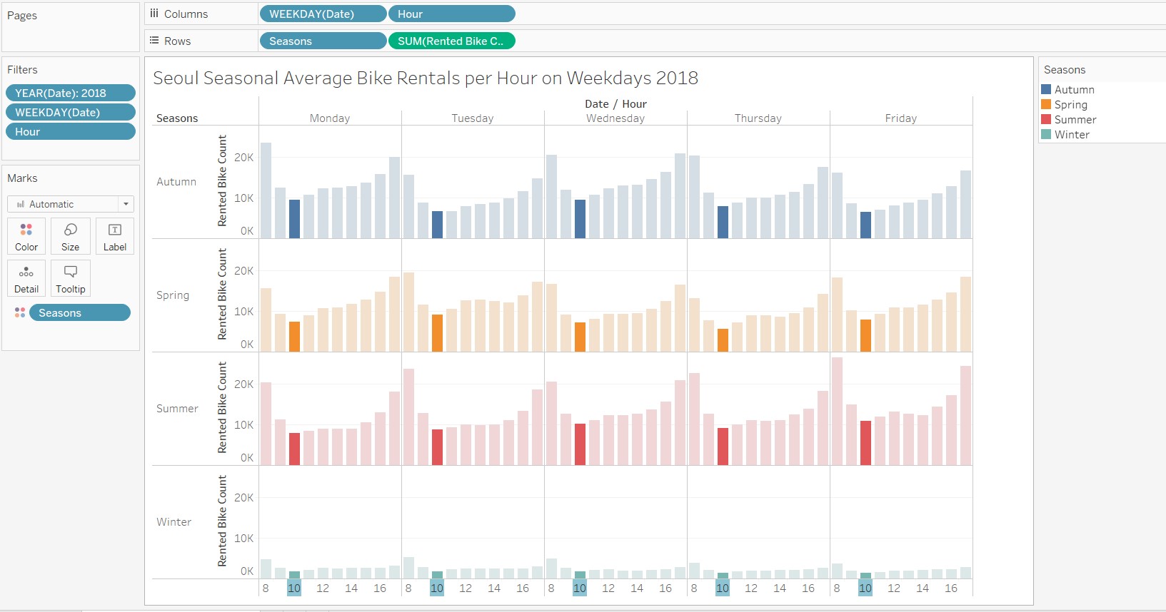
Here is some quick analysis of bike rentals in Seoul in 2018 I did as part of the Advanced Google Data Analytics Course. The stakeholder was looking for the best time of day to perform maintenance on their rental bikes. With some observational analysis it was apparent that 10 a.m. was the slowest time of day on weekday working hours for bike rental, and 9 a.m. to 3 p.m. was the slowest range of times for bike rentals. Therefore, the stakeholder should look to maintain their bikes in that window in order to affect rental traffic the least.